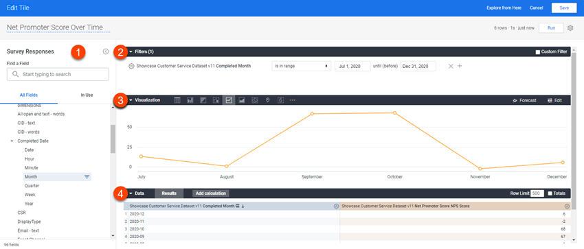
The Edit Tile dialog box
Configure the selected data and the appearance of your visualization tile in the Edit Tile dialog box.

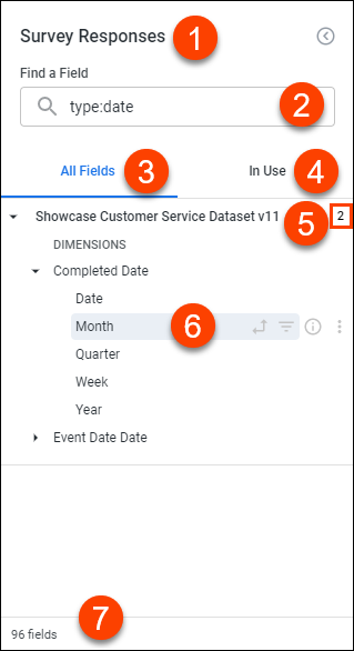
1. Field picker

- Explore name: Displays the name of the current Explore.
- Search
bar: Displays the search bar.
Use the search function to quickly select the specific fields you need. You can search in the following ways:
- Enter a search term in the search bar: Entering a string in the search bar will filter the field picker to display only the fields, views, and fields with descriptions that match all or part of a search string.
-
Enter a search modifier, or combination of search modifiers and search terms, in the search bar.
To perform a modified search, input a modifier into the search bar. Supported modifiers include:
- is: Identifies
the field type. For example:
- is:dimension
- is:measure
- is:filter
- type:
Identifies fields with a specific data type. For example:
- type:number
- type:string
- All
Fields tab: Displays all available fields.
The All Fields tab is the starting place for building a visualization and displays all the available fields that you can select for a query. Fields are organized alphanumerically by category (dimensions, followed by measures) under the name of the view in which they are defined.
Selected fields will appear highlighted in the corresponding field category color (blue for dimensions, orange for measures, green for table calculations), and corresponding field icons (pivot, filter) will appear in bold without you needing to hover your cursor over a field when it is active.
Click a field in the All Fields tab to add or remove it from your query.
- In
use tab: Displays all fields that are currently in use.
The In Use tab shows all fields that are currently active, organized alphanumerically and whether they are dimension or measures. The tab also displays the total number of active fields in the bottom left.
- View level summary: Displays the total number of selected fields.
- Field-specific
information and actions: Displays the current and potential options
for a field, and information about the field, such as field type.
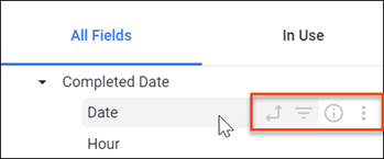
The icons next to each field provide more information about the field and indicate the available options for that field. The icons are visible when you hover a cursor over a field.

Icon Name Description 
Pivot data Click this icon to pivot or unpivot a field. This icon will appear gray when a field is not pivoted and bold when a field is pivoted. 
Filter by field Click this icon to add a field as a filter or to remove a field as a filter. This icon will appear gray when a field is not an active filter and bold when it is an active filter. 
Info Click this icon to view the field's data type, description (when available), and internal field name (in view_name.field_name syntax). 
More Click on this menu and select from the available options to quickly create custom fields depending on the field's type. - Explore summary: Displays the total number of fields in the current Explore.
Any custom fields and table calculations you create are listed under Custom Fields in both the All Fields and In Use tabs.
2. Filters panel
The Filters panel is where you define, view, and edit the filters applied to your visualization tile.
Filters enable you to limit the data displayed in your visualization tile. You have a lot of flexibility for creating filters with three different methods you can use, from simplest to most complicated: basic filters, advanced match filters, and custom filters.
3. Visualization panel
The Visualization panel is where you select the appropriate visualization for the selected data, control the appearance of the visualization, the colors used, and the x-axis and y-axis labels if applicable.
When you select the data fields to use in your visualization, and run your query, the application chooses a default visualization based on the query data. You can modify the default visualization, or select a different visualization that matches the data and meets your needs. Each visualization type has a large number of customization options you can use to create an effective visualization that presents information clearly and matches your organization's brand guidelines, if required.
For information on the visualizations (charts, graphs, and tables) supported, see Types of Visualization tiles.
4. Data panel
The Data panel is where you can view the results table with the data returned by your query, with any filters applied narrowing down the results displayed. The data shown is what will be included in your visualization.
You can add column totals to your report by clicking the Totals checkbox in the upper right and then running the report.
If your report contains more than one dimension, you can choose to include subtotals in your visualization by clicking the Subtotals checkbox.
You can also add row totals to your report, but only if you've added a pivoted field to your report.
If you've added row totals, and your query exceeds any row limit that you've set, you will not be able to sort the Row Totals column (although you can sort dimension and measure columns as normal). If you run into this issue, you can try increasing your row limit (up to 5,000 rows).
You can copy all the data from a table column. To do so, hover over a column label, click the gear icon, and then choose Copy Values.
This data can then be pasted into a document or spreadsheet.