Map visualization
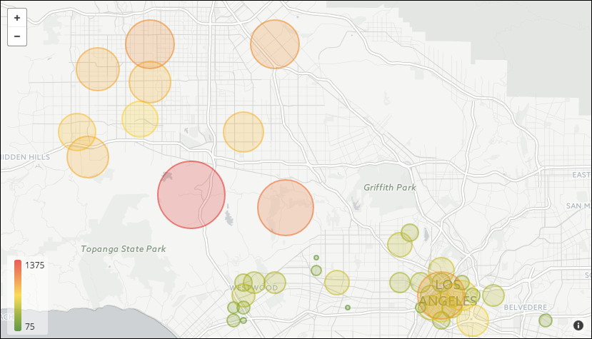
Best for visualizing interactive geographic data.
Note: Map visualizations work with profile
variables that meet all of the following requirements:
- The profile variable is named "Country".
- The values are either full name of the country or the 2-3 country code.
It is not required to be case sensitive.

The following options are available under each tab.
Tip: Customize and edit the
selected visualization type in the
Edit Tile dialog box by clicking
Edit.

Plot tab
Note: Options in the
Plot tab can differ depending on the dimension
used. Depending on the dimension data used, the following options are
available:
| Dimensions associated with maps | Dimensions not associated with maps |
|---|---|

|

|
| Options | Description |
|---|---|
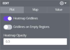
| Heatmap Gridlines | Adds a border around each of the gridlines used for the heatmap. |
| Gridlines on Empty Regions |
Note: This option is only available when
Heatmap Gridlines is enabled.
Displays an outline around map regions that have no data.
|
| Heatmap Opacity | Specify the opacity of the colors used in the
heatmap. A number between 0 and 1 can be typed.
|
| Options | Description |
|---|---|
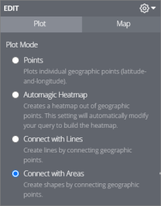
| Points | Plots each row in the Data table as a discrete point on the map. The location dimension places points of uniform size and color. Adding a measure to the Data table lets the points be scaled by color or size. |
| Automagic Heatmap | Displays the data as a heatmap grid. It dives the visible map into equal squares and calculates the values in your data to fit into each square. The squares are colored according to the measure chosen. Zooming in re-calculates the grid, so the granularity is appropriate to the zoom level. |
| Connect with Lines | Two fields of location dimensions are taken and are connected together in the visualization. Adding a measure enables you to add a color scale to the lines. |
| Connect with Areas | One location dimension is used to connect all the points in order of how they are sorted, then boundaries are formed in an area of the map. Format the size and color of individual location points by adding a measure. |
Map tab
| Options | Description |
|---|---|
| Map Style | Change the background of the map and
whether or not map labels should be displayed. The following options are
available:
|
| Map Position | Changes the center point and zoom level of
the map.
Note: Not available with the
Automagic Heatmap option.
|
| Map Scale Indicator | Determines if the map scale is shown and what units are displayed. |
| Allow Panning | Determines if the map can be repositioned by dragging. |
| Allow Zooming | Determines if the zoom in or out button is displayed in the upper left of the visualization. |
| Show Full Field Name | Determines if the name is displayed in tooltips when map data points are clicked. |
| Show Legend | Displays a map legend in the lower right of
the visualization.
Note: This option is only available when either of the
following options is enabled:
|
| Show Region Field in Tooltip | Displays the region information in the
tooltip of the map.
Note: This option is only available when it is with a dimension
with maps.
|
Value tab
| Options | Description |
|---|---|
| Value Colors | Defines the color of map points or the
range of colors used if color coding according to a measure. This field takes a
comma separated list of one or more color values. Values can be hex codes (for
example,
#b79d0f) or
CSS color names (for example,
mediumblue).
Note: If multiple colors are added in the field, colors will be
assigned to each data point in order. For example, the first data point in the
table will be the first color, and so on.
|
| Quantize Colors | Changes the color scale from a smooth gradient to specific colors set. |
| Reverse Color Scale | Switches the colors that indicate high and low values. |
| Minimum Value and Maximum Value | Sets the minimum and maximum values of the color range. Colors all points below a threshold with the lowest color and all points above with the highest color. |