Pie visualization
Best for visualizing proportional values.
The following options are available under each tab.
Tip: Customize and edit the
selected visualization type in the
Edit Tile dialog box by clicking
Edit.
Plot
| Options | Description |
|---|---|
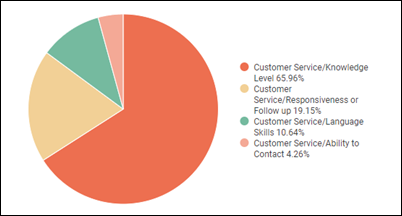
| Value Labels | Change how individual sections of the pie
chart are labeled. The following options are available:
Note: It is recommended to turn on
Value Labels so stakeholders can see
the values if you export the dashboard as a PDF.
|
| Label Type | Customize the format of the labels marking
sections in the pie chart. The following options are available:
Note: Label Type is only available when
the
Value Label field is set to
Labels.
|
| Inner Radius | Formats the pie chart as a donut chart by setting the length from the center, also known as the radius. Integers between 0 and 100 can be used to represent the total width (diameter) that will make up the hole. By default, it will appear as a pie chart if no value is set. |
| Start Angle and End Angle | Controls whether the pie chart appears as a
full circle or a portion of a circle.
Both fields use 360-degree angles and numbers between -360 and 360 can be entered. The full results of your data will be adjusted to fit the portion of the circle. Note: The visualization becomes a full circle if:
|
Series
| Options | Description |
|---|---|
| Collection | Select from a group of pre-selected colors. |
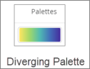
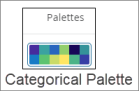
| Palette |
Choose one of several existing palettes or create a custom palette in the Custom tab. The following options are available:
Note:
|
| Reverse colors | Reverses the palette and applies colors at
the:
|


| Number | Options | Description | Screenshot |
|---|---|---|---|
| 1 | Arrow | Click the arrow to display all other options. | 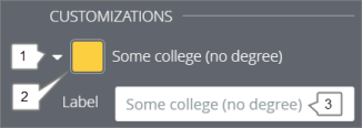
|
| 2 | Color | Select a custom color for the data point. This option overrides the color palette in the Colors section. | |
| 3 | Label | Enter a custom data point label. This impacts the chart legend and tool tips. |