Waterfall visualization
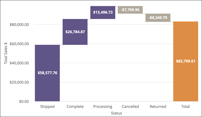
Use this visualization type to display sequential positive and negative values.

The following options are available under each tab.
Tip: Customize and edit the
selected visualization type in the
Edit Tile dialog box by clicking
Edit.

Series tab
| Options | Description |
|---|---|
| Collection | Select from a group of pre-selected colors. |
| Palette |
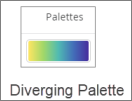
Choose one of several existing palettes or create a custom palette in the Custom tab. The following options are available:
Note:
|
| Reverse colors | Reverses the palette and applies colors at
the:
|
| Up Color | Select a custom color for the positive values in the chart. This option overrides the color palette in the Colors section. |
| Down Color | Select a custom color for the negative values in the chart. This option overrides the color palette in the Colors section. |
| Total Color | Select a custom color for the Total bar in the chart. This option overrides the color palette in the Colors section. |
Values
| Options | Description |
|---|---|
| Value Labels | Toggles the appearance of value labels for
each data point on the chart.
Note: It is recommended to turn on
Value Labels so stakeholders can see the
values if you export the dashboard as a PDF.
|
| Value Colors | Defines the color of value labels. This field
takes a comma separated list of one or more color values. Values can be hex
codes (for example,
#b79d0f) or
CSS color names (for example,
mediumblue).
Note: If multiple colors are added in the field, colors will be
assigned to each data point in order. For example, the first data point in the
table will be the first color, and so on.
|
X
| Options | Description |
|---|---|
| Scale Type | Specifies how the x-axis scale is calculated
and displayed. The following options are available:
|
| Show Axis Name | Displays the x-axis name label. |
| Axis Value Labels | Displays value labels on the x-axis. |
Y
| Options | Description |
|---|---|
| Show Axis Names | Displays y-axis name labels. |
| Axis Value Labels | Displays value labels on the y-axis. |
| Gridlines | Displays gridlines from the y-axis. Gridlines are spaced based on scaling of the y-axis. |


