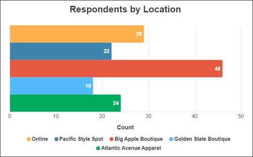
Bar (Modern) visualization
Use this visualization type to display categorical data with a modern look.
Note: Custom fields are not
supported in modern visualizations.

Tip: Customize and edit the
selected visualization type in the
Edit Tile dialog box by clicking
Edit.

Series
| Options | Description |
|---|---|
| Bar Orientation | Select the orientation of the
visualization:
|
| Line Colors |
Choose one of several existing palettes or create a custom palette in the Custom tab. The following options are available:
|
| Series Positioning | Select how the series are displayed:
|
| Show Color Gradient | Display each bar with a color gradient from light to dark. |
| Inner Spacing | Drag the slider to specify the amount of whitespace to add to the sides of the bars in the Vertical orientation, or top and bottom for the Horizontal orientation based on the Bar Orientation setting. |
| Show Value Labels | Choose to show or hide the value labels on each bar in the visualization. |
| Show Target | Select this option to display the target value of the measurement. |
| Target Value | The target value for the measurement being displayed. |
| Target Color | In the
Palettes tab, select a color from the
current palette, or click the
Custom tab and select a custom color.
The following options are available:
|
| Hide Category Labels | Hide the labels for the dimension used in the visualization. |
| Hide Measure Axis Labels | Hide the labels for the measure used in the visualization. |
Titles
| Options | Description |
|---|---|
| Graph Title | Enter the title to display above the visualization. |
| Graph Subtitle | Enter the subtitle to display above the visualization. |
| Show Subtitle | Choose to show or hide the Graph Subtitle. |
| Custom x-axis Title | Enter a title to override the x-axis title. |
| Show x-axis title | Choose to show or hide the x-axis title. |
| Custom y-axis Title | Enter a title to override the y-axis title. |
| Show y-axis title | Choose to show or hide the y-axis title. |
| Hide Legend | Choose to show or hide the legend. |
| Legend Position | Select Bottom to display the legend below the visualization, or Right to display it to the right of the visualization. |


