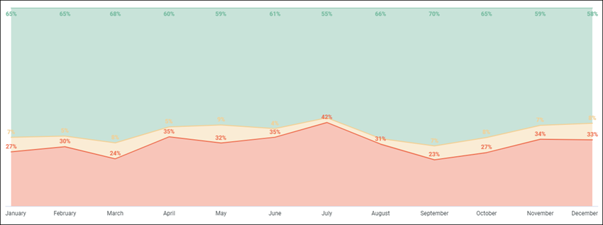
Area visualization
Best for visualizing shifts in quantities over time.

The following options are available under each tab.

Plot tab
| Options | Description |
|---|---|
| Series Positioning | Specifies how a set of data points is
displayed. The following options are available:
|
| Grid Layout | Separates the chart into smaller charts. Each
chart represents a single row or pivot from the
Data table.
Note: The maximum number of rows is 12.
The Number of Charts per Row option appears when a grid layout is selected. If you have more than 12 rows or pivots, limit your data by entering a number between 1 and 12. |
| Line Interpolation | Determines how lines are drawn on the chart.
Select one of the following options:
|
| Plot Null Values | Toggles the appearance of null values on the
chart. When the toggle is:
Note: This option is only available when the
Series Positioning option
Overlay is selected.
|
| Swap X and Y | Toggles whether x and y axes are swapped. When swapped, dimensions are plotted on the y-axis and measures on the x-axis. |
| Options | Description |
|---|---|
| Hide Legend | Toggles the appearance of the data points
legend on a chart.
Note: This option is only available when there is more than one
data point.
|
| Legend Align | Specifies whether the data point legend
appears on the left, center, or right of the chart.
Note: This option is only available when
Hide Legend is off, and there is more
than one data point.
|
| Options | Description |
|---|---|
| Limit Displayed Rows | Show or hide rows in a visualization, based
on their position in the results. The following options are available:
Note: This option depends on the row order. Changing the sort
order or adding a row limit can affect which rows are shown or hidden.
|
Series tab
| Options | Description |
|---|---|
| Collection | Select from a group of pre-selected colors. |
| Palette |
Choose one of several existing palettes or create a custom palette in the Custom tab. The following options are available:
Note:
|
| Options | Description |
|---|---|
| Show Full Field Name | Shows the name of the data source and the
dimension.
For example, the data source is in profile variables and the dimensions chosen is Count. When it is toggled on, it is displayed as "Profile Variable Count". |
| Options | Description |
|---|---|
| Points Style | Specifies how data points appear on the
chart. Select from one of the following options:
|
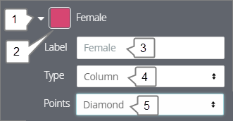
| Number | Options | Description | Screenshot |
|---|---|---|---|
| 1 | Arrow | Click the arrow to display all other options. | 
|
| 2 | Color | Select a custom color for the data point. This option overrides the color palette in the Colors section. | |
| 3 | Label | Enter a custom data point label. This impacts the chart legend and tool tips. | |
| 4 | Type | Displays a different visualization type for
the data point. The following options are available:
Use this option to combine different visualization types on the same chart. For example, show one data point as a column and the other a line. |
|
| 5 | Points | Select the shape of the chart points if the Type is set to area, column, line, or scatter. |
Values
| Options | Description |
|---|---|
| Value Labels | Toggles the appearance of value labels for
each data point on the chart.
Note: It is recommended to turn on
Value Labels so stakeholders can see the
values if you export the dashboard as a PDF.
|
| Label Null Columns | Toggles the appearance of labels for null data points. |
| Value Colors | Defines the color of value labels. This field
takes a comma separated list of one or more color values. Values can be hex
codes (for example,
#b79d0f) or
CSS color names (for example,
mediumblue).
Note: If multiple colors are added in the field, colors will be
assigned to each data point in order. For example, the first data point in the
table will be the first color, and so on.
|
| Font Size | Sets the font size of value labels using any CSS size. For example, 12px, 2 em, or 100%. |
| Value Rotation | Sets the rotation of value labels. Values can
be between -360 and 360.
Note: This option is only available when the
Series Positioning option
Grouped is selected.
|
| Value Format | Specifies the format of the value. For more information, see Numeric formatting for visualizations. |
X
| Options | Description |
|---|---|
| Scale Type | Specifies how the x-axis scale is calculated
and displayed. The following options are available:
|
| Reverse Axis | Toggles the direction of the x-axis. When the
toggle is:
|
| Show Axis Name | Toggles the appearance of the x-axis name label. |
| Custom Axis Name | Sets a custom name for the x-axis name label.
Note: This option is only available when
Show Axis Name is enabled.
|
| Axis Value Labels | Toggles the appearance of value labels on the x-axis. |
| Gridlines | Toggles the appearance of gridlines extending from the x-axis. Gridlines are spaced based on scaling of the x-axis. |
| Label Rotations | Sets the rotation of the x-axis labels. Values can be between -360 and 360. |
| Time Label Format |
Note: The
Time Label Format may not work because of the lack
of a time dimension.
|
Y
| Options | Description |
|---|---|
| Gridlines | Toggles the appearance of gridlines from the y-axis. Gridlines are spaced based on scaling of the y-axis. |
| Reverse Axes | Toggles the direction of the y-axis. When
the toggle is:
|
| Left Axes and Right Axes | Configure the chart's y-axis. Drag and drop a Measure to create a new axis. |
| Options | Description | ||||||||||||
|---|---|---|---|---|---|---|---|---|---|---|---|---|---|
| Scale Type | Specifies how the y-axis is calculated and
displayed. The following options are available:
|
||||||||||||
| Show Axis Name | Displays the appearance of y-axis name labels. | ||||||||||||
| Show Axis Values | Toggles the appearance of y-axis values. | ||||||||||||
| Unpin Axis From Zero | Focus on the area where data exists rather than showing the full scale starting as zero. | ||||||||||||
| Axis Name | Enter a label for the selected y-axis. | ||||||||||||
| Y Axis Format | Specifies the number format of the y-axis values, independent of underlying dimension or measure. For more information, see Numeric formatting for visualizations. | ||||||||||||
| Tick Density | Sets the density of tick marks on the y-axis.
The following options are available:
|
||||||||||||
| Minimum Value | Defines the minimum value for select y-axis. | ||||||||||||
| Maximum Value | Defines the maximum value for the select y-axis. | ||||||||||||
| Add Reference Line | Enables the creation of reference lines in a
chart. Multiple lines are able to be created and to delete a reference line
click the
X button.
The following options are available once selected:
|


