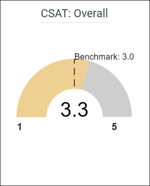
Radial Gauge visualization
Customize and edit a Radial Gauge chart visualization type.

The following options are available under each tab.

Plot
The following options are available in the Plot tab.
| Options | Description |
|---|---|
| Trellis By | Creates multiple smaller charts each representing a single row or pivot and sorts it by Row or Pivot. |
| Trellis Rows/Columns | Increase or decrease the number of trellis rows or columns. |
| Radial Gauge Angle | Adjust the angle of the arc. |
| Radial Gauge Cutout | Adjust the size of the cutout in the middle of the arc. |
| Range Min/Max Override | Set the minimum and maximum values for the visualization. |
| Range Label Font Size | Set the font size for the range labels. |
| Range Label Value Formatting | Customize the formatting of the range labels. For example, enter 0.00 to display the range with two decimal places. |
| Spinner Type | Select the design of the spinner. This identifies the location of the value being shown the way the speedometer has a pointer to display the current speed. |
| Arm Length | Customize the length of the bottom of the
arc.
Use the Thickness slider next to Arm Length to adjust the thickness of the arms. |
| Pointer Length | Customize the length of the spinner.
Use the Thickness slider next to Pointer Length to adjust the thickness of the spinner. |
| Range Width | Adjust how far the range label is from the arc. |
| Range Height | Adjust how high the range label is from the bottom of the arc. |
Style
The following options are available to customize the visualization:
| Options | Description |
|---|---|
| Gauge Fill Type | Select the gauge fill type.
|
| Gauge Fill Color | Select a custom color for the data point. |
| Gauge Segment Colors |
Choose one of several existing palettes or create a custom palette in the Custom tab. The following options are available:
|
| Background Color | Select a custom color for the background. |
| Pointer Color | Select a custom color for the spinner. |
| Range Label Color | Select a custom color for the range labels. |
Target
You can specify a target to show the goal or expected value for the metric you are visualizing. Users of the dashboard will be able to quickly see the current measured value compared to the target value.
The following options are available to customize the visualization:
| Options | Description |
|---|---|
| Target Source | The selected target source appears in the
visualization. The following options are available:
Note: Override allows you to manually specify the target value.
A number needs to be entered in
Target Value Override to use the
Override option.
|
| Target Label Type | Customize the label displaying the target source. |
| Target Label Font Size | Set the font size of the target label. |
| Target Value Override | Set a custom target override number. This specifies the position of the target line on the visualization. |
| Target Label Override | Customize the override label. |
| Target Value Formatting | Specify the formatting of the target value. For example, enter 0.00 to display the target with two decimal places. This option only applies if you have First Measure or Second Measure selected, and not specified a Target Label Override. |
| Target Label Padding | Adjust the spacing between the target label and the arc. |
| Target Length |
Adjust the length of the dashes on the target line. |
| Dash Gap | Set the gap between dashes forming the target line. |
| Thickness | Set the thickness of the dashes. |
Value
The following options are available to customize the visualization:
| Options | Description |
|---|---|
| Value Label Type | Select from the list of label types at the bottom of the arc. |
| Value Label Font Size | Set the font size of the value label. |
| Value Formatting Override | Specify the formatting of the value. For example, enter 0.00 to display the value with two decimal places. |
| Value Label Override | Set a custom value label to use. This only applies if you selected Value and Measure Label or Only Label in Value Label Type. |
| Value Label Padding | Adjust the spacing between the bottom of the arc and the label. |
NPS® drill down
If the visualization shows NPS℠1 Score data, users can drill down by clicking the NPS Score value. Up to 500 rows are displayed with the following information:
- Date: The date the NPS response was recorded.
- Respondent Member ID: The unique ID for the member.
- Follow Up: The respondents' comments on the rating.
- Response Status: The status of the survey (Complete, Incomplete, etc.).
- Category: The NPS category of the response (Promoter, Passive, Detractor).
- Median of NPS Response: The NPS score.
For more information, see Drilling into NPS score visualizations.


