Table visualization
Customize and edit a table visualization type.

The following options are available under each tab.

Plot
The following options are available in the Plot tab.
| Options | Description |
|---|---|
| Table Theme | Changes the theme colors of the overall table. |
| Show Row Numbers | Assigns each row a value starting from 1 in the table. |
| Show Totals | Shows the total for each column at the bottom of the table. |
| Show Row Totals | Shows the total for each row at the right of the table. |
| Transpose | Switches the visualization's rows to
columns and the columns switch to rows.
Note: This option is available for visualizations with only one
dimension.
|
| Limit Displayed Rows or Limit Displayed Columns | Allows you to either Hide or Show a selected number of rows or columns starting from the First or the Last row or column. |
Series
The following options are available to customize the whole table:
| Options | Description |
|---|---|
| Truncate Text | Truncates text from columns. |
| Show Full Field Name | Shows the name of the data source and the
dimension.
For example, the data source is in profile variables and the dimensions chosen is Count. When it is toggled on, it is displayed as "Profile Variable Count". |
| Size Columns to Fit | Resizes the widths of all columns to fit in the tile. |
Customization section displays each dimension and measure selected and allows you to customize the:
| Icon | Fields | Description |
|---|---|---|

|
Label | Label displayed on the table. |

|
Width | The width of the column. |

|
Text color | Color of the text. |

|
Background color | Color of the background of the column. |
| Bold | Apply bold formatting to the text. | |
| Italics | Italicize the text. | |
| Underline | Underline the text.
Note: Underlining does not work.
|
|
| Align Left | Align values to the left. | |
| Center | Align values to the center. | |
| Align Right | Align values to the right. | |

|
Format | Format the number with a decimal, percentage, or currency symbol. |

|
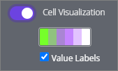
Cell Visualization | Displays bars for each value in the table.
Click the color palette and select from either:
Selecting Value Labels shows the values next to each bar. It is recommended to select Value Labels when exporting the dashboard as a PDF. For more information about selecting a color, see the customize palette section in Change the colors in your visualization. Note: The
Cell Visualization field is available
only for options in the
Measures section.
|
Formatting
| Sections | Options | Description |
|---|---|---|
| Colors | Collection | Select from a group of pre-selected colors. |
| Customizations | Rows | Increases the font in each row. |
| Header | Increases the font in the header. The
following also customization is available for the header:
|
|
| Enable Conditional Formatting | Defines rules that color code the table.
Note: Conditional Formatting works only when subtotals are not
displayed and
Cell visualization in the
Series tab is toggled off.
The following options are available when Conditional Formatting is enabled:
|
|
| Rules | Move | Drag and reorder rules.

|
| Add | Adds a rule.
 
|
|
| Remove | Removes a rule.

|
|
| Apply to | Select whether it will apply to either all numeric fields or a selected measure. | |
| Format | Specifies which numeric values the rule
will apply to.
Additional fields can differ between values selected. The following Format fields can customize the Background color, Font color, or Font style:
The along the scale Format option allows you use the following options:
|
|
| Background color | Color of the background of the values. | |
| Font color | Color of the values. | |
| Font style | Bold, italicize, or strikethrough the
values.
Note: The strikethrough
Font style
does not work.
|
|
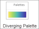
| Palette |
Choose one of several existing palettes or create a custom palette in the Custom tab. The following options are available:
Note:
|
|
| Reverse colors | Reverses the palette and applies colors at
the:
|
|
| Use X color steps | Limits the number of colors used in the
palette to the specified step value. When the option is:
For example, if you specify 2 color steps, the data is grouped into 2 groups and only 2 colors will be displayed on the table. Note: You can insert numbers from 2 to 100 in the color step.
|
|
| Mirror range around center value | Make equal color shifts on either side of the color palette. For example, on a scale from -100 to 0 to 100, values -20 and 20 will be the same color distance. | |
| Range | Specify the values that determine the palette gradient start (0%), center (50%), and end (100%) colors. |
Column Options
On the table, near the end of a column, click the Gear button. The following column options appear:
| Options | Description |
|---|---|
| Freeze | Freezes the table column to the left side of the chart. The frozen column remains visible while scrolling horizontally. This option can be applied to multiple columns. |
| Copy Values | Copies all values in the column. Use this option to quickly paste values into a spreadsheet or text file. |
| Autosize All Columns | Sizes the width of each column to fit the column heading name or longest value. |
| Reset All Column Widths | Resizes the width of all columns to the default width. |


