Create a Touchpoint Classic Dashboard
A touchpoint dashboard is created with predefined template tiles from a touchpoint activity with the potential to add custom tiles.
An activity with a status of Draft can not be used to create a touchpoint dashboard.
-
The following text analysis visualizations are created when there
are Open End questions with responses.
Please contact your Alida Customer Success representative to enable Text Analysis.
Tile Description Taxonomy 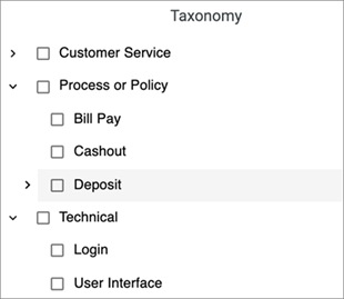
The taxonomy tile displays a list of categories Open End responses fall under. Categories are created hierarchically with multiple levels of subcategories where Open End responses are grouped together and categorized. Note: The Taxonomy tile requires the community to have a taxonomy model set up. Please contact Professional Service for more information.Sentiment Over Time 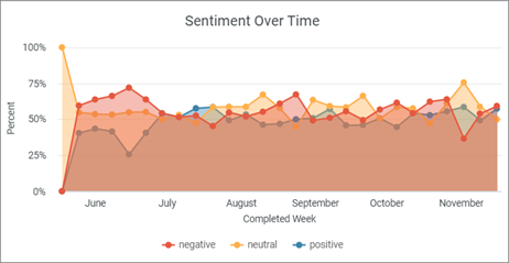
Sentiments are shown at the response level over a period of six months. Filter by sentiments to see how the sentiments shift month by month. Total Number of Text Responses 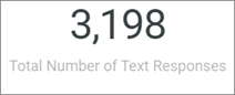
The total number of text responses from all Open End questions. Note: The number may look inflated compared to the number of responses in NPS®1 By Category because it contains the total number of text responses from Open End questions as well.Sentiment by Category 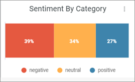
Sentiments are extracted from each Open End response at the sentence level. For example, if a response is "The product is great and easy to use.", it is categorized as positive. Key Phrase Sentiment Analysis 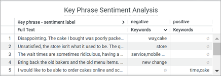
The full response is displayed along with key phrases sorted into either positive, negative, or both sentiments. The key phrases selected best describe the subject of the Open End response and multiple key phrases can be extracted from each response. For example, with a sentence such as, "The product is great! But the price is too expensive.", words like "product" will be categorized as positive and "price" as negative.
Key Phrases Word Cloud 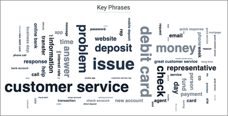
A word cloud of key phrases where the size is proportional to the frequency of the key phrase. Hover over a key phrase to see how many times it has been used overall. A key phrase is counted every time it is mentioned. For example, if the key phrase "issue" is mentioned three times in one sentence it will count three times.
Sentiment By Key Phrase 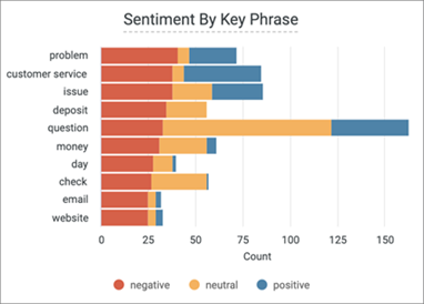
The top ten most frequent key phrases found in Open Ends are broken down by sentiments. Sentiments are split into three categories, positive, neutral, and negative. Hover over each sentiment to see how many times a key phrase is mentioned.
Note: Recall, a measure of the completeness of the analysis, is less than 100%. This means that not all key phrases can be clearly associated with a sentiment. For example, the algorithm may not assign the phrase "riot police" a negative sentiment, even though a human likely would. Only key phrases successfully associated with a sentiment will be displayed.Note: If Text Analysis is enabled there is no limit to the number of questions used in Text Analysis visualizations. -
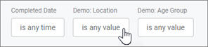
Use the existing filters for a refined view of the dashboard.